Alerting the driver to a nearby nuclear power station! This must be the right shape and border colour and have a simplified pictogram on it that successfully suggests ‘Nuclear Reactor’ [tip: have a look at the shape of some of them on Google images etc].
• A TOURIST INFORMATION SIGN
Pointing in the direction of Worcester’s ‘New Bridge’ over the River Severn. The sign would be sited somewhere near McDonalds. The sign must have a simplified rendering of the new bridge on it with the text ‘New Bridge’ and be pointing towards the bridge.
• A MOTORWAY SIGN
To be sited on the approach to Worcester on the M5 before it crosses the A4538 [Worcester North] junction. The sign would be seen by motorists travelling SOUTH. On it is to be shown the junction number, the word “Worcester” [and associated ‘A’ Road at turn off] and the distance to the junction [1m].
From the above options, I have chosen to design the warning sign.
For this brief, I began my initial research by looking at other existing warning signs:

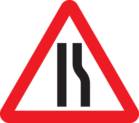


Warning signs (at least the majority of them) are triangles with a striking red border. The red border makes the sign stand out from the rest, I decided to sketch some alternative shapes for the sign:


After completing some sketches on the potential different shapes, I think that this warning sign being triangular is already successfully does its job by being eye catching and recognisable, so I am not going to change its appearance too much. I also decided to experiment with some different colours instead of the red border around the triangle shape.


After these colour experiments, the only colours that stand out enough to be on a warning sign is the orange colour.
I came up with a concept on changing the warning sign idea into a two step thing. Red being the absolute worse warning possible and amber/orange being not so bad but still something to take into consideration. Although I'm not entirely sure that this concept is necessary because people take the red warning signs into consideration whether they are important or not. There may be a problem with the signage that people may see the orange signs and not really see them as important because they are only a potential warning or that it isn't as important as a red warning sign.
The initial thought that comes into my head when thinking about nuclear power and nuclear power stations is the standard nuclear symbol and then the standard nuclear powers station outline.

I worked on some concepts based on the research that I completed above:


Below are final drawings of the above sketches:


No comments:
Post a Comment