Thursday, 25 February 2016

Initial Sketches

I have come up with some very simple sign shape ideas as a starting point for this brief:

The following are the basic concepts for the sign design for the directional signs:


This idea is having a circle sign as if it is a slice of a tree trunk, this is keeping in with the woodland and nature theme, the sign would probably be plastic as it would last for longer without the need for any maintenance and the text would probably be white so that it stands out from the brown tree trunk.


This idea is extremely simplistic but I don't feel like I can rule out the simple ideas just yet as they do work for all audiences. The arrow would be cut out and put on a sign post or trees or a fence, somewhere that it would be easily seen. The word would be place inside of the arrow. The colour schemes of the arrow would probably be green or brown, again with white text.


This idea came from inspiration, on my previous blog post where there is the Forestry Commission has posts with the different routes on it. In this idea, I would have a big information map with the different routes on it in which the users could see the route was red, for instance, and then follow all of the red markers. This would then enable the tutor/teacher/students to say "Follow the red route" and when the system is up and running, it would work successfully.


The following are my sketches of rough concepts of information signs:


This idea has been seen many times before and it is the main style of information signs that is used, especially in the Wyre Forest and other Forestry Commission places (evidence of which can be seen on my previous blog post). This style is bold and noticeable but it does have its limitations, for instance, wheelchair users and small children wouldn't be able to read this without looking up and potentially straining their necks which isn't ideal.


This is very similar to the above information sign style apart from the fact that it is slanted which means that it is also lower to the ground. This would solve all problems mentioned above regarding wheelchair users and children.


This idea came from inspiration which I acquired from looking at coastal path signage (evidence of which can be found on my previous blog post). The signs found on coastal paths and by the sea are a lot more attractive and in my opinion have had a lot more thought put in them and their appearance. Although the majority of the coastal path signs are quite tall, therefore resulting in some users being unable to read the signs, I could decrease the size and the height so that it would be suitable for all ages but it would be different, more attractive and therefore would draw in the user into looking at the information. Another idea which I could do which is an add on to this idea is a wider, less tall version of the sketch above which would hold a lot of information still but would be more attractive than the standard boards. Below is a sketch of the above idea.


Lakeside Brief- Initial Research

The main aim for this brief is to provide directional and informational signs for the new Lakeside Campus. The signs need to be suitable for many different audiences, such as students, children and adults (teachers and parents). The signs should be interesting and bright for the children but this factor shouldn't take away the practicality of the product as it's main and most important job is to direct the users and to give information to the users.

I am going to begin my research by looking into the following:
- Directional Signs
- Woodland Directional Signs
- Woodland Signs
- Information Signs
- Woodland Information Signs
- Coastal Signage

Directional Signs:


The above directional signs all feature arrows of some sort to point the user in the correct direction.

Woodland Directional Signs:


The directional signs which are found in the woods/forests are very minimal and they fit in to their surroundings by being a wooden post. They don't host a large amount of information on the post yet they do have colours which are different routes that you follow to get to the different places (visitors centre) or if you look for another post with the colour of your route, you follow that.

Information Signs:


The above are standard information signs, they usually as flat but they sometimes can be slanted, the slanted ones would be suitable for children as well as people with disabilities in wheelchairs as it would be at a suitable height level for them to see the board.


Woodland Information Signs:


The information signs which I have taken from the Forestry Commission signs are all mostly green painted wood and if they aren't green, they are just solid wood. The information signs that state the name of the forest uses icons and symbols similar to the road sign. The information sign on the bottom right hosts a large amount of information, this is a style of information design is something I would like to try.

Coastal Signage:


I decided to look at some coastal path signs as I feel that they put across information in a very attractive way which are very different in comparison to the forest information boards which I think is definitely something that I am going to explore.

Wednesday, 17 February 2016

Design a Road Sign

A WARNING SIGN

Alerting the driver to a nearby nuclear power station! This must be the right shape and border colour and have a simplified pictogram on it that successfully suggests ‘Nuclear Reactor’ [tip: have a look at the shape of some of them on Google images etc].

• A TOURIST INFORMATION SIGN

Pointing in the direction of Worcester’s ‘New Bridge’ over the River Severn. The sign would be sited somewhere near McDonalds. The sign must have a simplified rendering of the new bridge on it with the text ‘New Bridge’ and be pointing towards the bridge.

• A MOTORWAY SIGN

To be sited on the approach to Worcester on the M5 before it crosses the A4538 [Worcester North] junction. The sign would be seen by motorists travelling SOUTH. On it is to be shown the junction number, the word “Worcester” [and associated ‘A’ Road at turn off] and the distance to the junction [1m].

From the above options, I have chosen to design the warning sign.

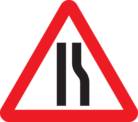
For this brief, I began my initial research by looking at other existing warning signs:


Warning signs (at least the majority of them) are triangles with a striking red border. The red border makes the sign stand out from the rest, I decided to sketch some alternative shapes for the sign:


After completing some sketches on the potential different shapes, I think that this warning sign being triangular is already successfully does its job by being eye catching and recognisable, so I am not going to change its appearance too much. I also decided to experiment with some different colours instead of the red border around the triangle shape.


After these colour experiments, the only colours that stand out enough to be on a warning sign is the orange colour.

I came up with a concept on changing the warning sign idea into a two step thing. Red being the absolute worse warning possible and amber/orange being not so bad but still something to take into consideration. Although I'm not entirely sure that this concept is necessary because people take the red warning signs into consideration whether they are important or not. There may be a problem with the signage that people may see the orange signs and not really see them as important because they are only a potential warning or that it isn't as important as a red warning sign.

The initial thought that comes into my head when thinking about nuclear power and nuclear power stations is the standard nuclear symbol and then the standard nuclear powers station outline.


I worked on some concepts based on the research that I completed above:


Below are final drawings of the above sketches: